Foundations of Microsoft Excel Dashboards, Data Analysis and Visualization
-
 By
Jordan Goldmeier
By
Jordan Goldmeier
- 12/08/2021
Course Description
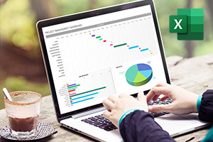
Dashboard aids in tracking key performance indicators or metrics and making decisions based on them and they can be created with a variety of different tools. However, due to its ease of use and universal availability, Microsoft Excel is an excellent choice for creating and distributing dashboards. This Microsoft Excel training will illustrate the process of developing interactive dashboards and starts by discussing the need to start thinking about data challenges differently and stepping away from the traditional way of processing data. A scope of methods and strategies for working efficiently with formulas is explained and you will learn how MS Excel uses a calculation engine to integrate multiple inputs to execute calculations on a spreadsheet. The content of this free online Microsoft Excel tutorial then moves on to show you what the VLOOKUP function does and how to use it as well as the formula for doing various computations on one or more arrays.
The significance of sorting functions in the systematic ordering of data is explained in the following section. You will discover although the used functions are not specifically designed to sort data, they perform well in this capacity. Following that, this Microsoft Excel course explains how decision functions are not functions such as IF or CHOOSE but rather functions such as AGGREGATE that assists in bringing data together to make the best decision. The next part of the course discusses filtering segments of data, the SUMPRODUCT function, MS Excel controls and ActiveX controls as well as what formula-driven development is.
The last part of this data visualization training details how to construct an attractive, attention-grabbing dashboard and the important role that visual perception plays not only in data visualization but other fields as well. Theories and themes such as the attributes of preattentive features and the Gestalt grouping laws are explained in detail which sets the basis for learning about interactive dashboards, infographics and other creative data visualization methods. These data visualization principles can be applied to the final section of the course where the procedure for creating customized charts and bullets is explained. Enrolling in this in-depth data visualization online course will open a world of creativity using your passion for data analytics and data science as the foundation for creating attractive, functional dashboards, infographics, and other methods of visualizing data. Whether you are a professional using large sets of data in your daily work or a statistics or finance student wanting to refine your data processing skills with beautiful visuals, this course is perfect for you.
What you'll learn in this course?
-
VLOOKUP
-
Data Analysis
-
Microsoft
-
Excel
-
Data Visualization
-
Analytics
Course Curriculum
Jordan Goldmeier
USA